

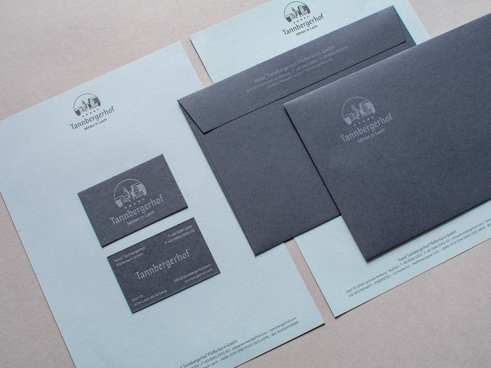
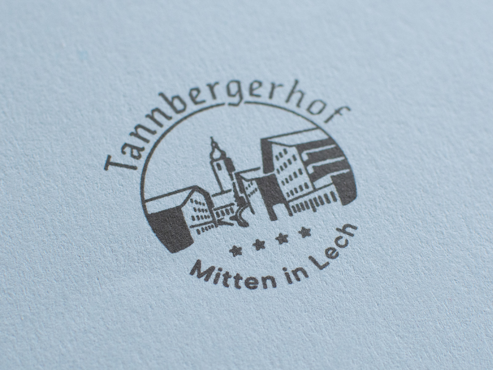
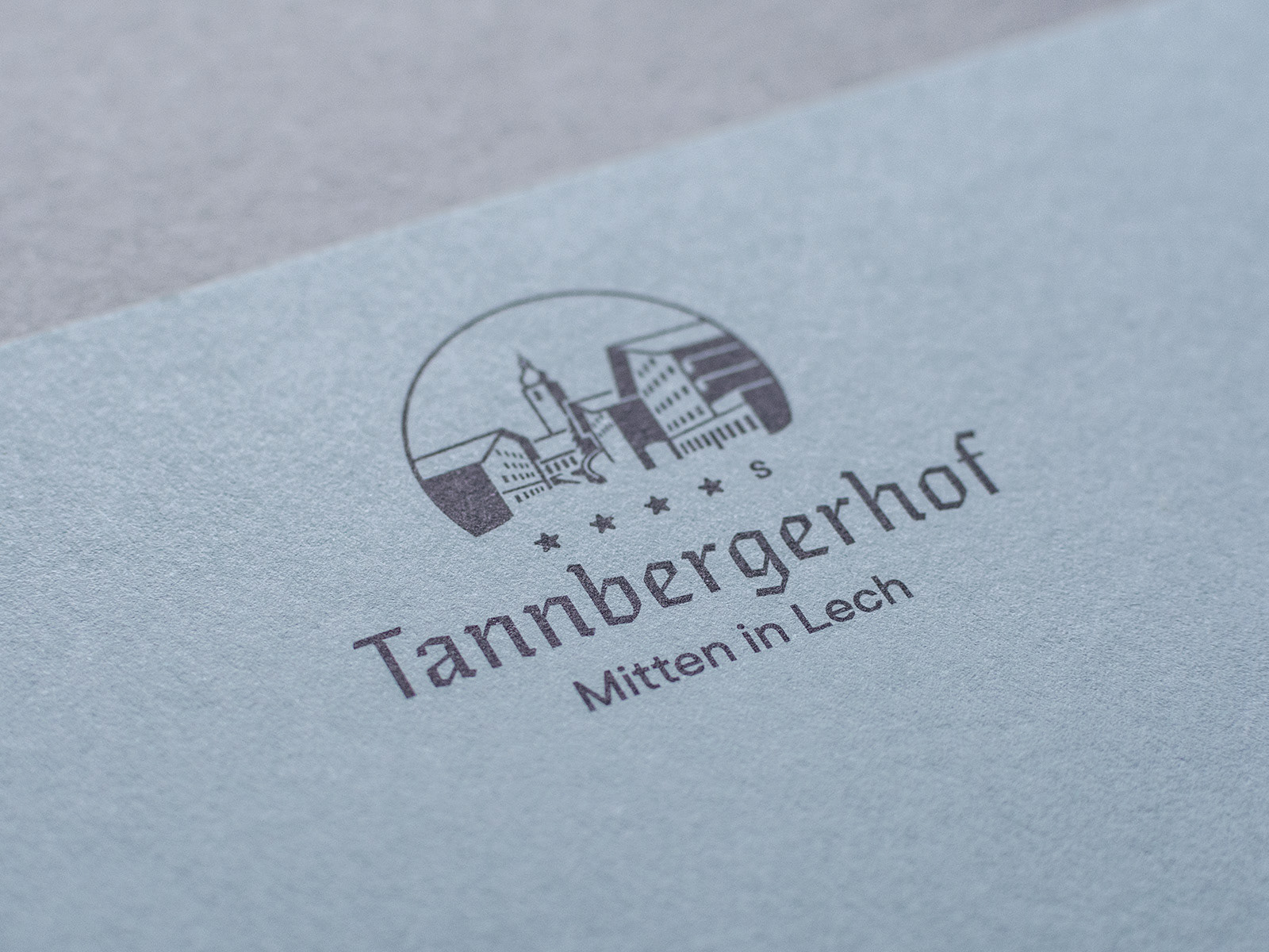
D: Neues Branding für den Tannbergerhof in Lech. Das Hotel hat 2019 die Besitzer gewechselt und so wurde es auch Zeit für einen neuen grafischen Auftritt. Die Frakturschrift im Logo hat eine traditionelle Anmutung, jedoch wirkt sie durch die dünne Strichstärke und der modernen Ausführung nicht altgebacken. Zudem gesellt sich eine geometrische Groteskschrift als allgemeine „Hausschrift“. Das Icon entspricht der Ansicht vom Lechufer in Richtung Kirchturm – das Symbol für das Dorfzentrum – wobei der Tannbergerhof im rechten Bereich zu sehen ist. Links sieht man das Hotel Korne, das wie der Tannbergerhof, von der Familie Pfefferkorn geführt wird.
E: New branding for the Tannbergerhof in Lech. The hotel changed hands in 2019 and so it was time for a new graphic appearance. The black letter typeface in the logo has a traditional impression, but thanks to the thin stems and the modern design, it doesn't look old-fashioned. In addition, there is a geometric sans serif font as a general “house font”. The icon corresponds to the view from the Lech riverbank in the direction of the church tower - the symbol for the village center - with the Tannbergerhof on the right. On the left you can see the Hotel Korne, which, like the Tannbergerhof, is run by the Pfefferkorn family.
Papier / Paper: Keaykolour Navy Blue + Steel;
Schriften / Fonts: Eskapade Fraktur + TT Commons;
Druck / Printed by: Wenin, Dornbirn + Infinitive Factory, Graz (Letterpress);
Schriften / Fonts: Eskapade Fraktur + TT Commons;
Druck / Printed by: Wenin, Dornbirn + Infinitive Factory, Graz (Letterpress);
Basisdrucksorten, Offsetdruck + Letterpess, Keaykolour Steel + Navy Blue.
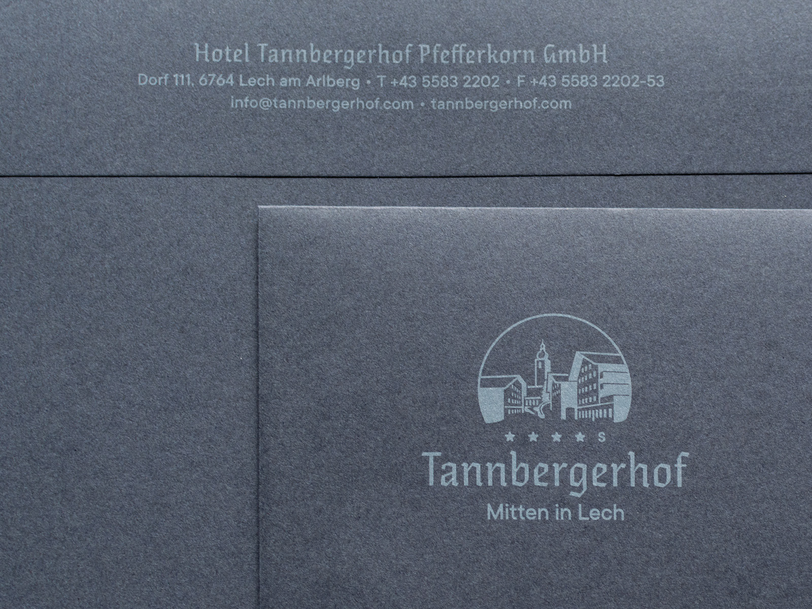
C5 Kuverts, 1-farbig Deckweiß auf Keaykolour Navy Blue,
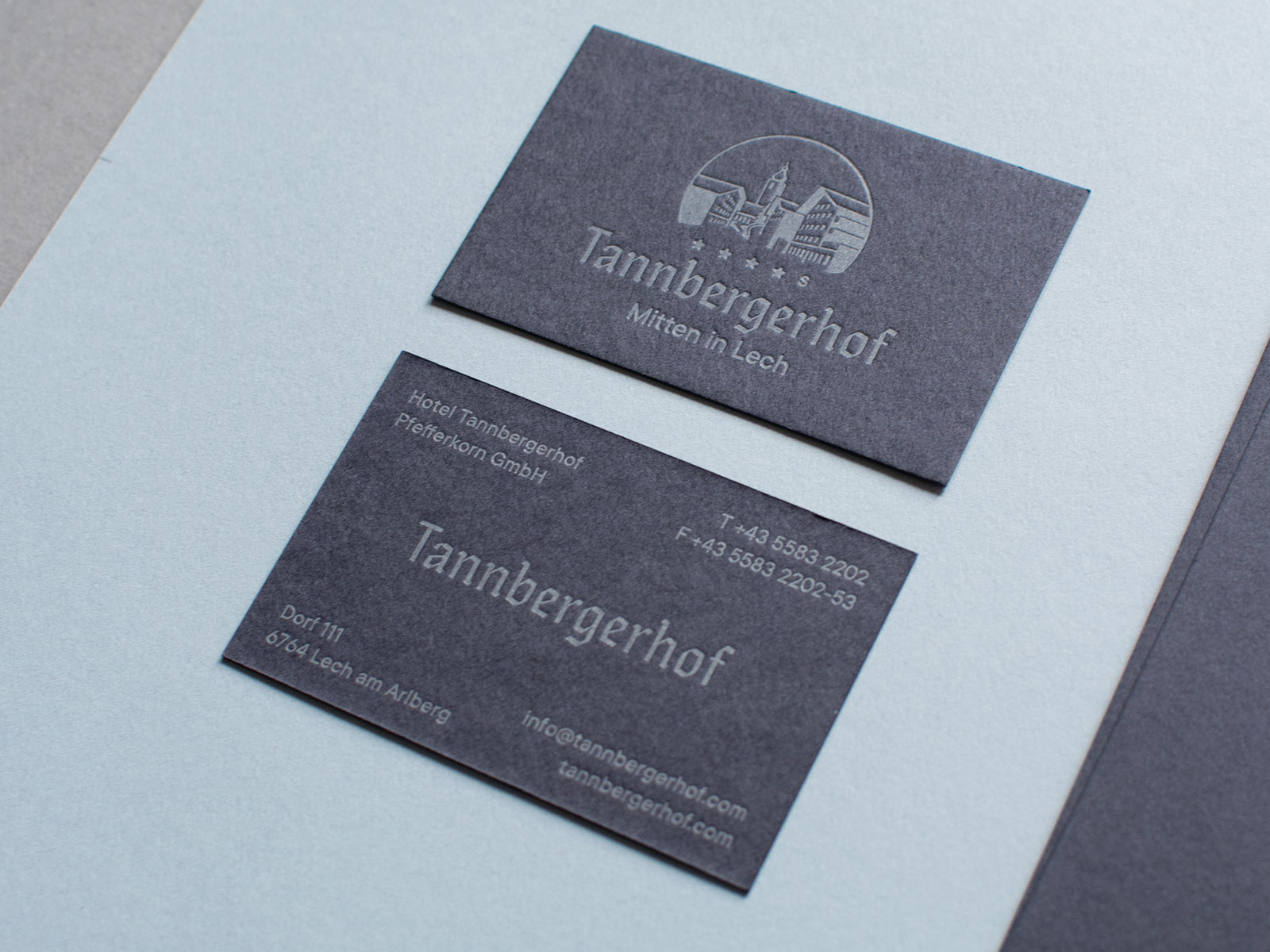
Visitenkarten, 1-farbig Letterpress auf Keaykolour Navy Blue.
Rundstempel.
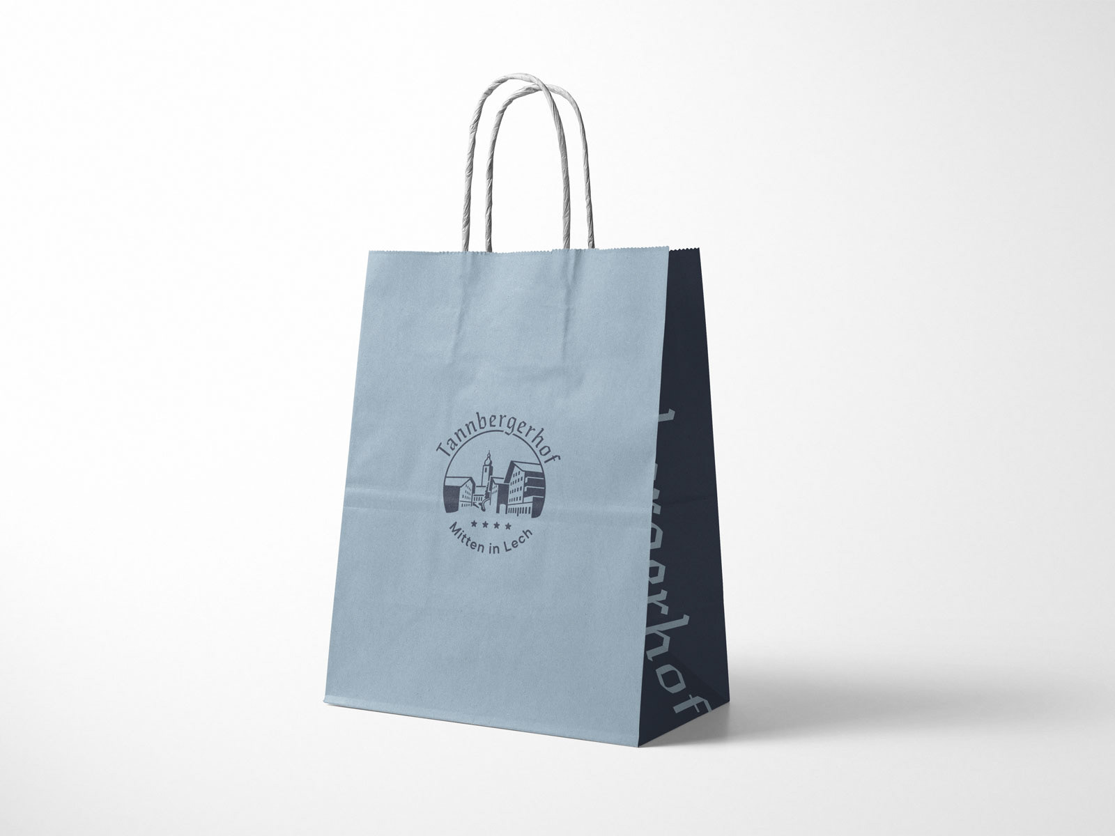
Entwurf für Papiertaschen.
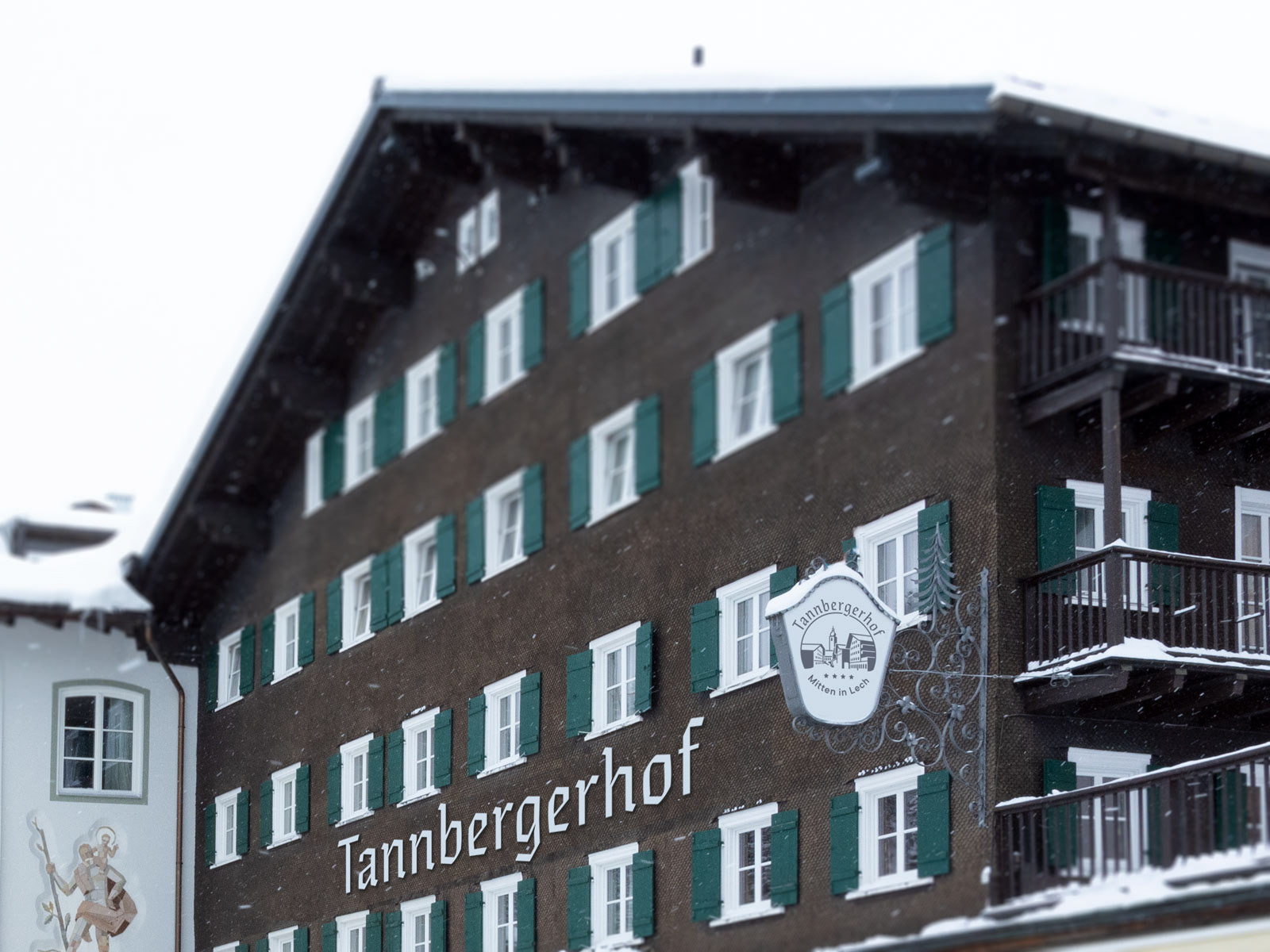
Entwurf der Fassadenbeschriftung und Anwendung am bestehenden Leuchtkasten.
Briefkopf, 1-farbig Offset auf Keaykolour Steel.